Cinema Website Revamp
Tools
- Figma
- Adobe Photoshop
- FlowMapp
About Project
In my User Interface Design course, I had the opportunity to revamp a cultural website that, in our opinion, suffered from poor design. My choice was the renowned Cracow cinema,Kino pod Baranami🡕, known for its cluttered and impossible-to-use website.
Professor's Feedback
Antonina Jasińska🡕
Your presentation at the review was the best, you managed to interest the entire group and keep their attention - this is a valuable skill. I really wanted to praise you for this project, both for the entire analytical process and the design approach itself. Ultimately, more views were created than required, which is definitely a big plus. I am especially glad that you have refined the purchasing process so much and that despite everything you managed to maintain such consistent asceticism in formal solutions throughout the website. Thanks to this, the design is fresh, clean and very legible/functional.
Problem
Potential customers struggle to find events and film viewings at art-house cinema
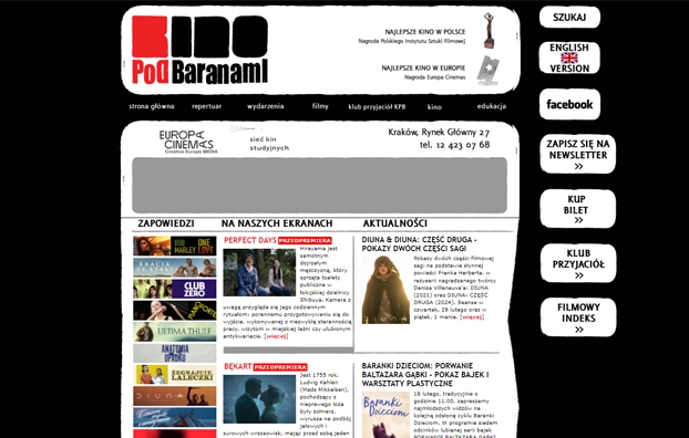
The website of "Kino pod Baranami" is notorious for its user-unfriendliness, yet the cinema itself boasts a rich tradition that resonates with people who yearn for the unique experience of screenings and discussions at this iconic venue. However, faced with escalating taxes andheightened competition in the screening industry, potential patrons often find themselves frustrated and disheartened, navigating a cumbersome website that leads them to abandon their purchases before reaching completion.
Solution
Crafting clear, easy to read and popular design by taking inspiration from the e-commerce websites
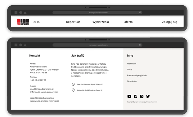
Enhanced navigation with a clear hierarchy
👉 Reorganizing previously chaotic and duplicated content into well-defined headers and footers
👉 Concealing less critical information in the footer to streamline both the website and user experience
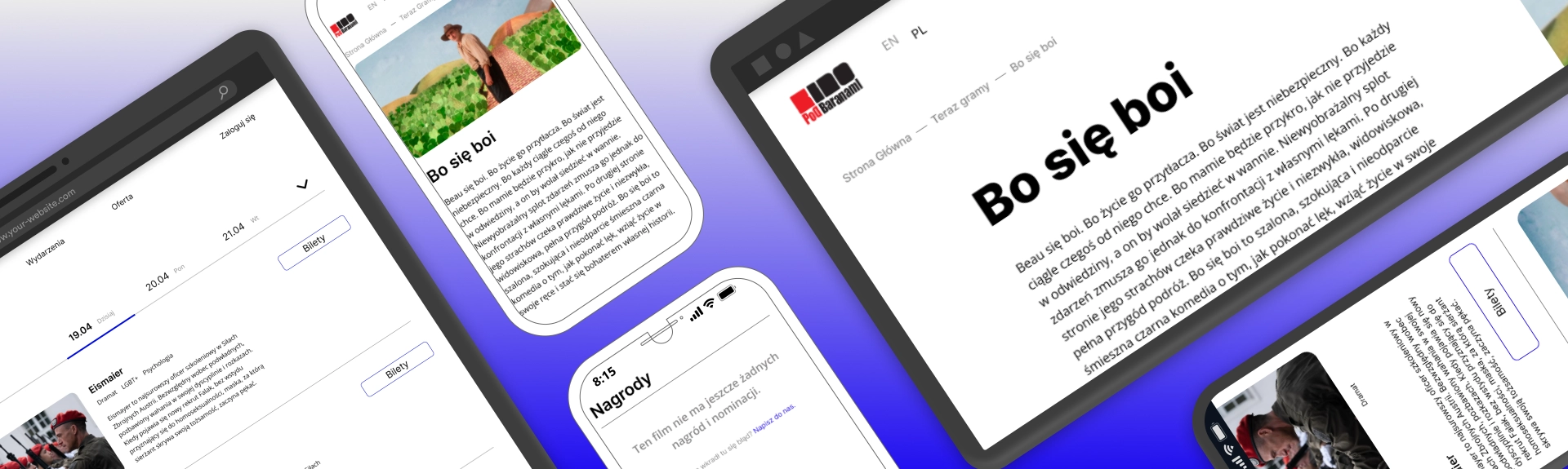
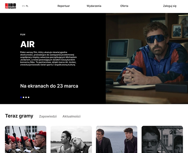
Main Page makeover
👉 Adopting an e-commerce approach by featuring current hot films, events, and customer promotions in a prominent banner at the top of the page.
👉 Simplifying the content presentation by eliminating the now playing, announcements, and events categorization. Instead, showcasing only the newest videos with relevant tags and detailed information about each video.
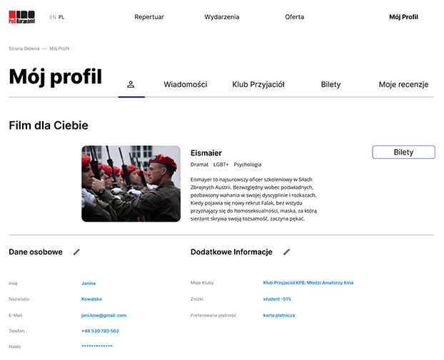
Exclusive benefits for loyal patrons
👉 Effortless management of discounts and club memberships
👉 Personalized movie suggestions tailored just for patron
👉 Access to comprehensive history of watched videos alongside with convenient option to leave reviews and share thoughts
👉 Easy retrieval of purchased tickets for hassle-free cinema experiences
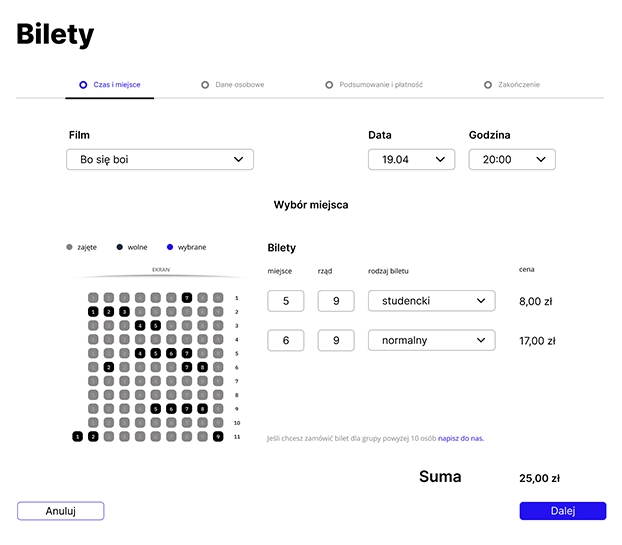
Seamless ticketing experience
👉 A dedicated ticket purchasing page seamlessly integrated with the overall website aesthetics
👉 Effortless access to download tickets, showcasing them conveniently through QR codes
👉 Introduction of a previously absent feature: the option to purchase group tickets for a more inclusive cinema experience
Process
The process involved extensive research about competition, patrons preferences, history of the Kino pod Baranami cinema, page analysis, testing with potential users and many, many iterations. The process was not linear - it involved lots of going back and forth towards the goal.
Research

Wireframing
Prototype
Testing
Final Design
Research
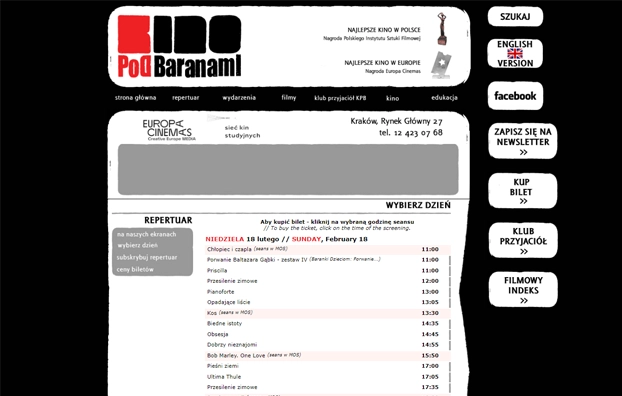
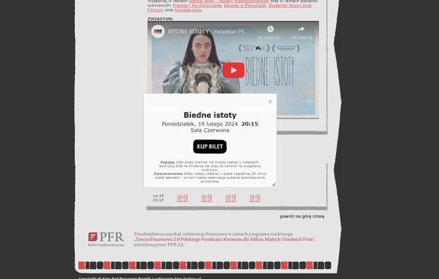
Website Analysis
👉 Difficult to understand, chaotic, three-level navigation with enormous amount of hidden sections
👉 Overwhelming home page where it is difficult to find information about current films and events taking place in the cinema
👉 Navigating the ticket purchase flow is unnecessarily complicated, requiring almost six steps before reaching the actual purchasing site.
👉 The cinema is proud of the long history of its discussion club and cordially invites you to participate in activities, however, it does not offer a place for a club member or permanent patron on the website
User Interviews & Testing
I conducted user interviews and tests with two experienced patrons and two new customers, using the attached script. The key takeaway is that even experienced users struggled with tasks, with some taking over 2 minutes before completing a purchase. For new users unfamiliar with navigating the website, almost none were able to finish the presented tasks.
👉 The Interview Script and Results 👈
Lo-Fi Wireframing
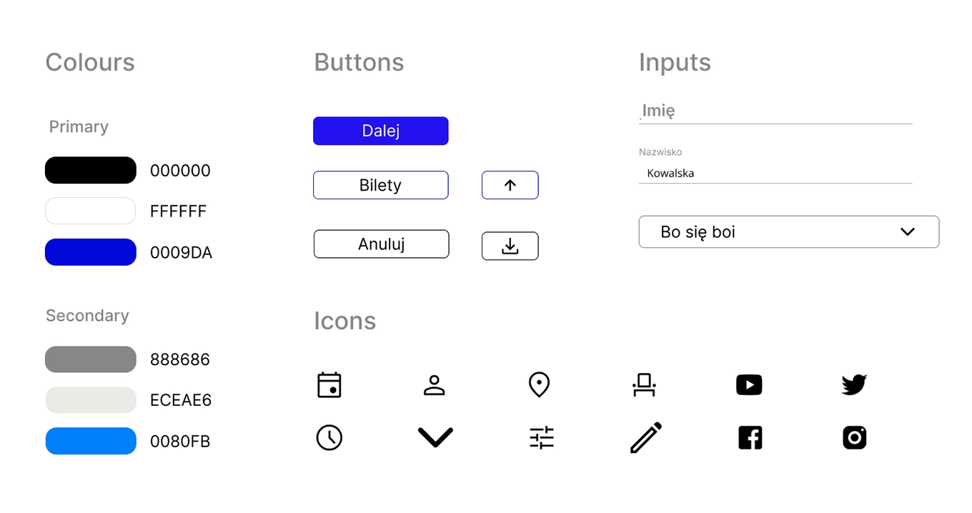
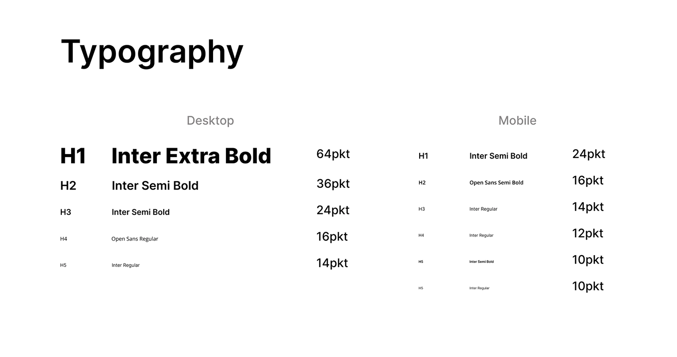
Style Guide
Final Design & Evaluation
“I love it! It would make my life so much better! You should talk to the Kino pod Baranami about this project!” -Aleksandra Drab🡕 regular patron
👉 You can check my Figma File here 👈
Reflections
My main three insights:
Transformation through user-centric design
The redesign of Kino pod Baranami's website prioritized user-centric design, alleviating frustrations for both experienced patrons and newcomers. The resulting clear hierarchy and personalized features signify a transformative shift beyond aesthetics, catering to the diverse needs of the cinema's audience.
Seamless integration of functionality and aesthetics
Success is found in the seamless integration of functionality and aesthetics, where the revamped main page not only enhances visual appeal but also streamlines the user journey. Consistency in design, from ticket purchasing to exclusive benefits, contributes to a visually pleasing and highly functional website.
User Feedback as catalyst for change
User insights, gleaned from interviews and testing, spurred meaningful improvements, addressing patron frustrations and challenges for new users. The positive response from a regular patron validates the project's potential to create a more engaging and user-friendly online environment for Kino pod Baranami.